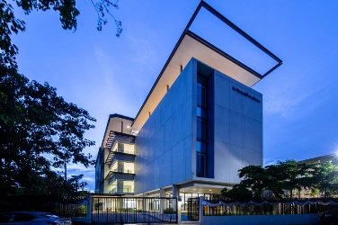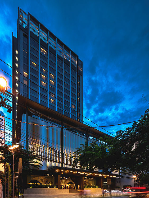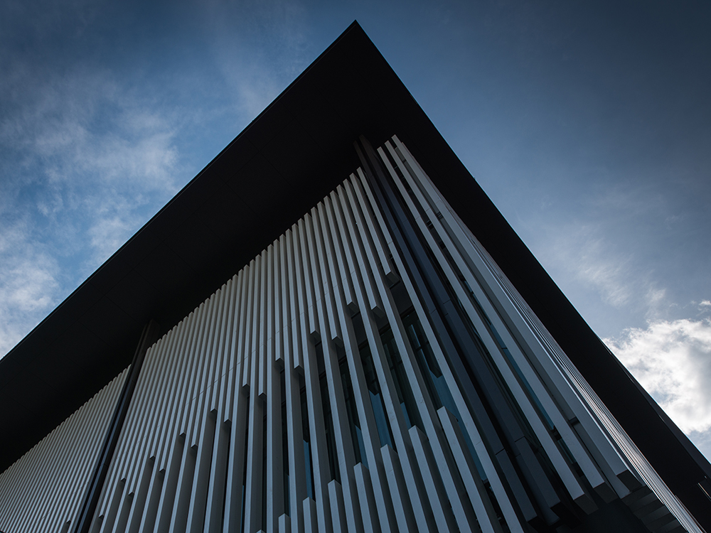

Double Tree by Hilton is a refurbishment of an existing
30-year-old hotel on Sukhumvit 26, connected back-to-back with the 5-star
Hilton Sukhumvit on Sukhumvit 24, with the aim of transforming the look and
feel into a contemporary building which emanates the 4-star Double Tree Brand.
A49 was thus engaged to design the façade of both hotels.
While the Hilton targets more established clients, the
Double Tree caters to business-oriented and active travelers. The
interior and exterior design reflects the hotel’s intention to create an appealing
environment tailored specifically to their guests.
Elements of the
façade were duplicated on both hotels, with subtle modifications, to create a
sense of connection between the two. The most distinct example being the
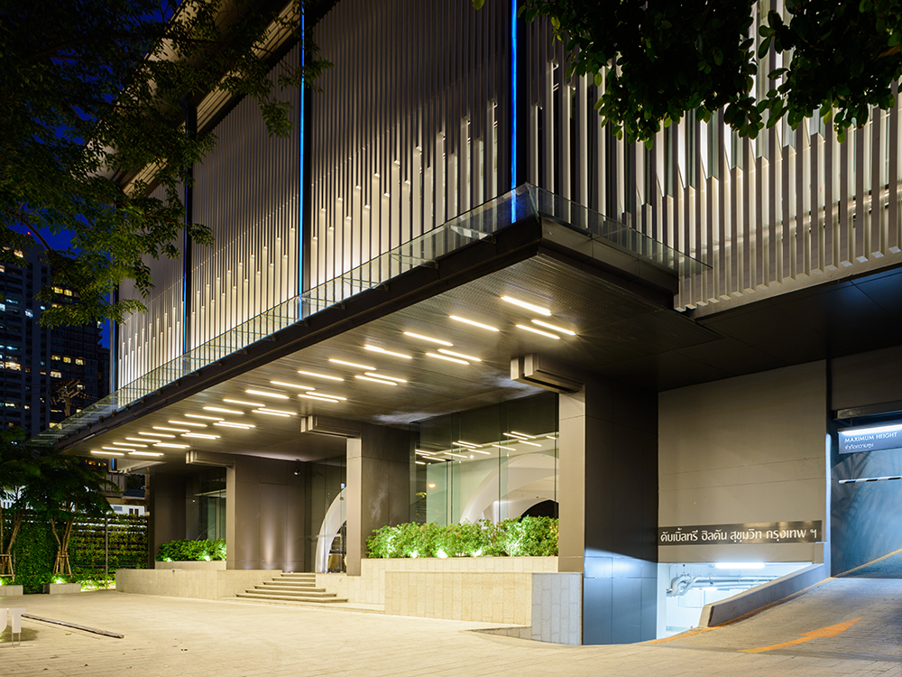
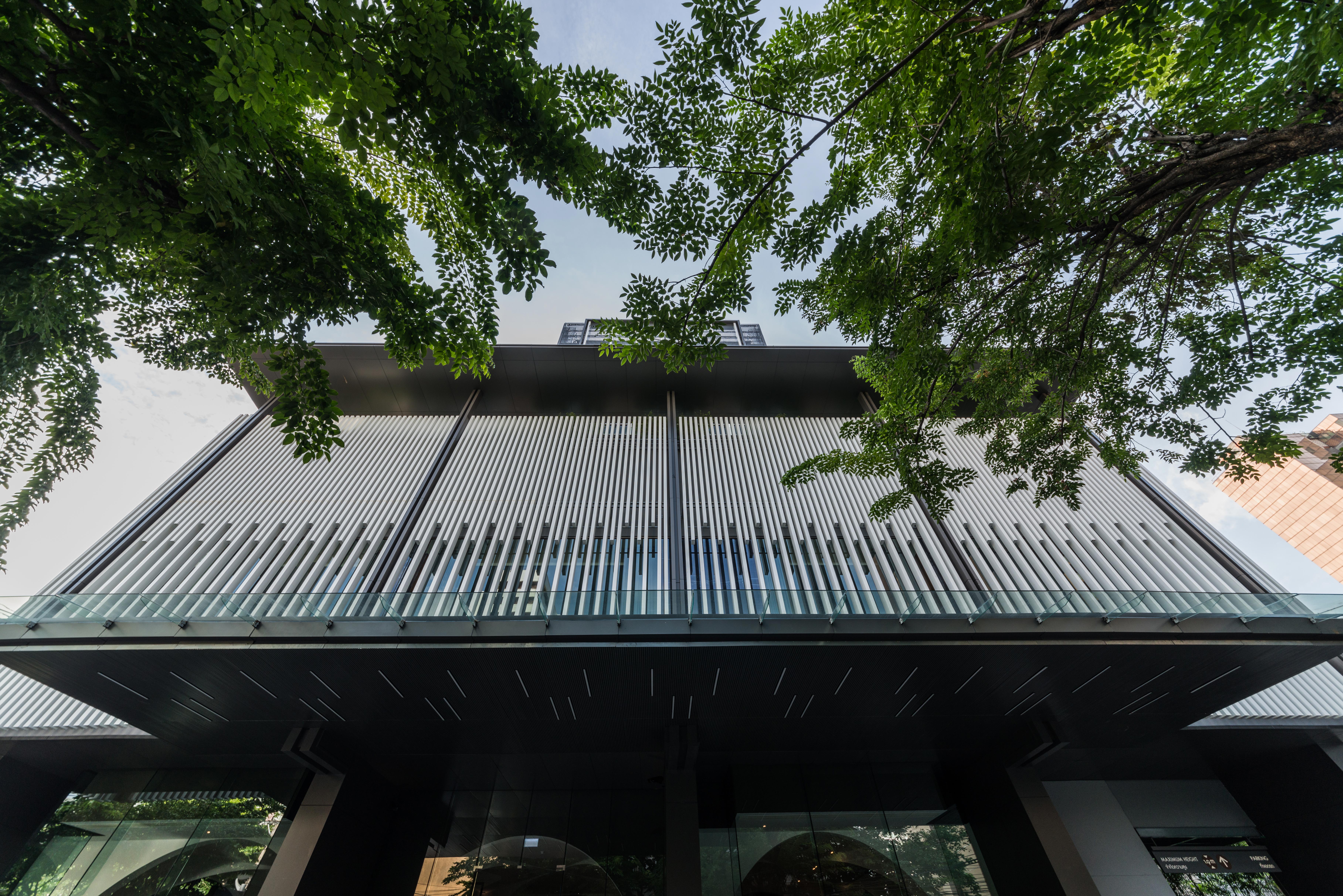
vertical white aluminum fins on the Hilton façade, which were repeated on the
ballroom windows of the Double Tree with a different effect, and stand out
against the varying shades of grey on the building façade.
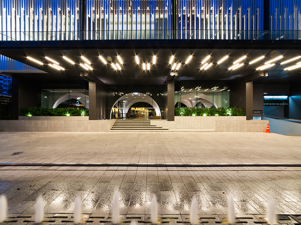
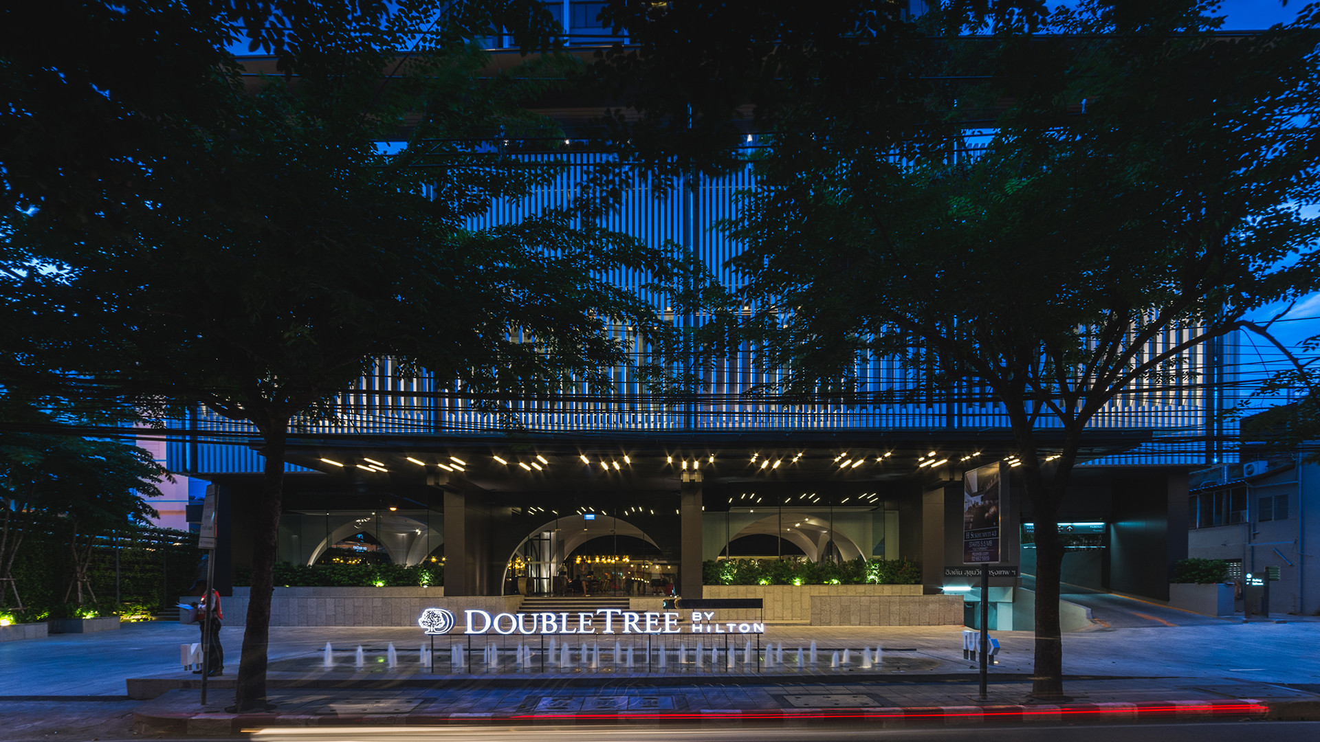
Entry to the porte cochere and hotel lobby was improved, in
co-ordination with the landscape architect, by simplifying the access path and
creating a visual connection to the front entrance, welcoming the guests. The overhanging roof of the 7th floor pool terrace completes the
street-side façade.
The tower is accentuated with white vertical fins, making
the building appear tall and slender. These were extended skywards to white columns,
concealing the existing roof structure, and capped horizontally. This
composition of clean, geometric lines give the building a modern contemporary
vibe while maintaining a tropical oriental ambiance befitting its Bangkok
setting.
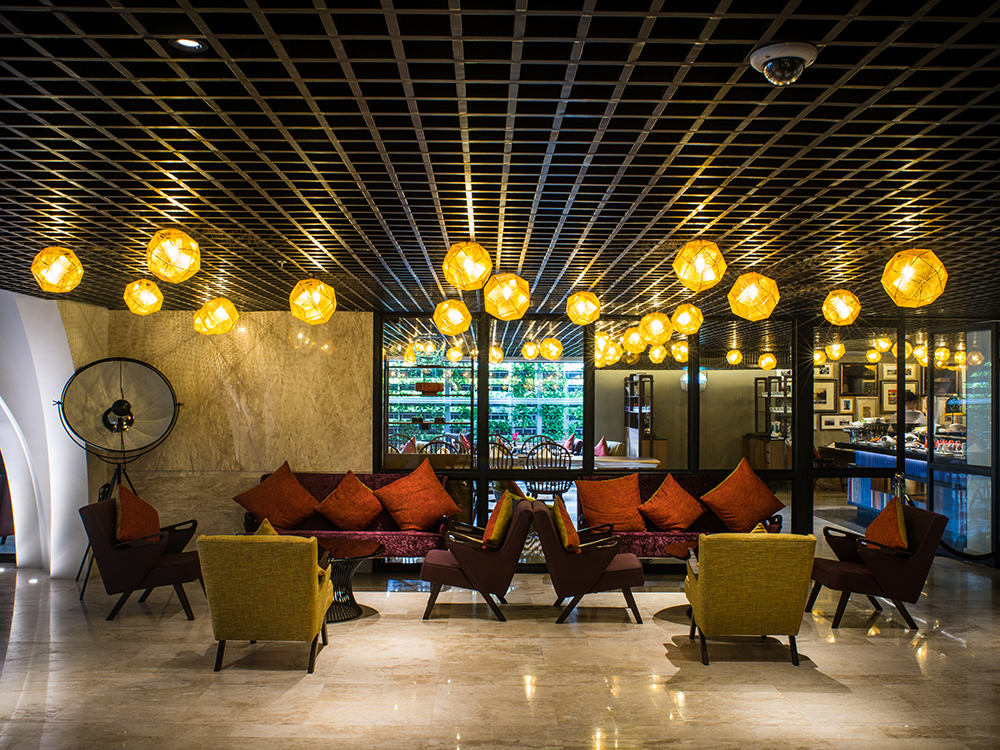
The interior was designed to contrast and complement the exterior architecture, and existing low ceilings were positively transformed to a warm, cozy, residential-like atmosphere creating a memorable impression of a home away from home.
K.C.S. & Associates
W. AND ASSOCIATES Designs
PIA Interior
P Landscape
With Light
Beourfriend
Curtain Well Design Consulting
TRI Construction Management


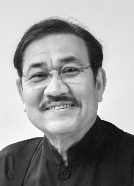
In 1980, Prabhakorn received his Bachelor of Architecture degree from Chulalongkorn University. He continued his education at the Catholic University of America in Washington DC, where he graduated with a Master of Architecture degree in 1984. Whilst in Washington DC, Prabhakorn worked at Robert Schwinn & Associates in Maryland before returning to Thailand and joining A49 in 1985. At A49, he has been responsible for a wide range of projects ranging from mega complexes and high-rise buildings to houses. Most of these are located in Thailand, whilst others are located in other countries in the region, including: China, Malaysia, Singapore and Vietnam. His work has also extended outside that region, for example, to the United Arab Emirates and India. All add breadth to the A49 portfolio of work. His main role has been to establish major policies, design concepts and strategic planning initiatives. He was appointed as President of Architects49 Phuket in 2005 and President of Architects49 International in 2006.
Prabhakorn actively served the Association of Siamese Architects (ASA) as its Head of Public Relations from 1992 to 1994, as its Vice President of Foreign Affairs from 1995 to 1997, and as the President of ASA during 2002-2004. He has also participated in many subcommittees for both the ASA and the Architect Council of Thailand (ACT). He is an active Council Member of the ACT, with his present duties for them extending into 2018. He has been an Honorary member of the Japan Institute of Architects (JIA) since 2003.
Prabhakorn has been a key member of A49 since its foundation, and has the honour of being trusted by Nithi Sthapitanonda (the Founder of A49) to be President and Managing Director of 49Group.

In collaboration with Landscape Architects 49, we have extensive experience in master planning and urban design. We have worked for both government and private sectors from large urban development to planning of new university campus.
