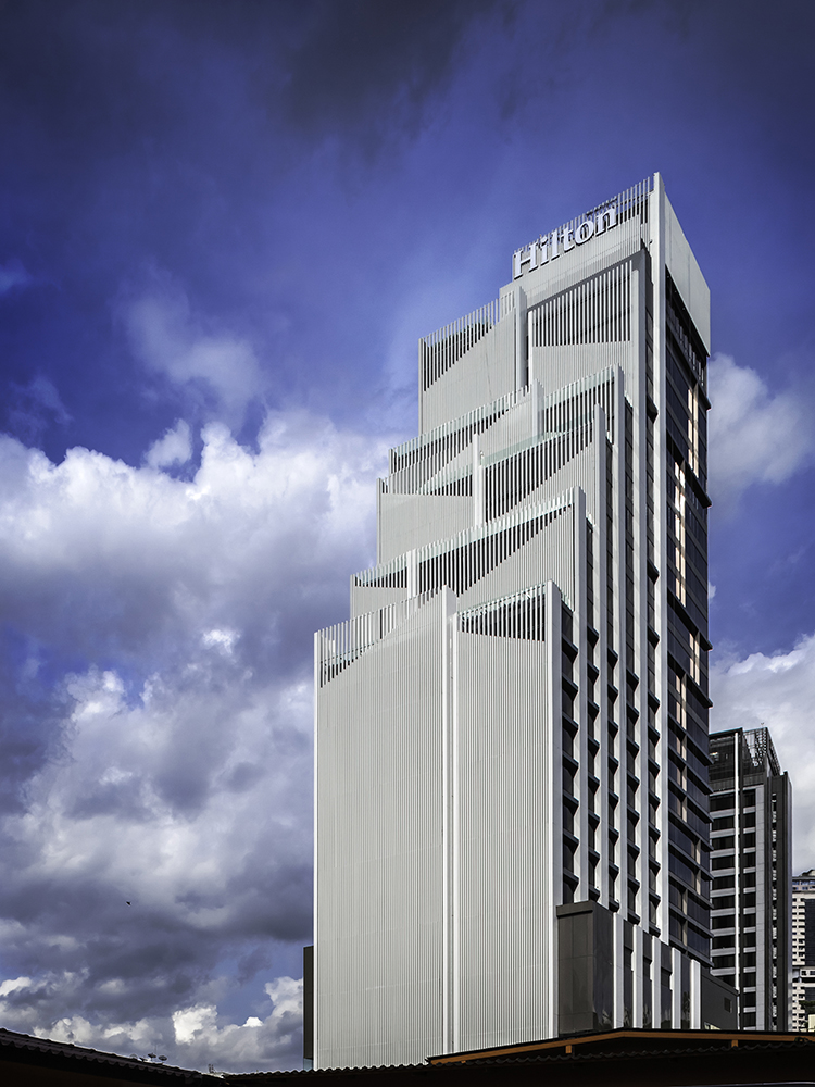

Due to its central location, Sukhumvit 24 is rapidly
becoming a high-end, residential neighborhood conveniently close to a mass
transit line, a public park, a shopping centre and numerous multi-national
cuisine restaurants. It is a very popular area amongst expats residing in
Bangkok. The client recognized the opportunity to develop a 5-star hotel to fit
in with the neighborhood and acquired an ajoining hotel on Sukhumvit 26, thus forming
a shared service area supporting both hotels.
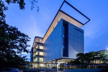
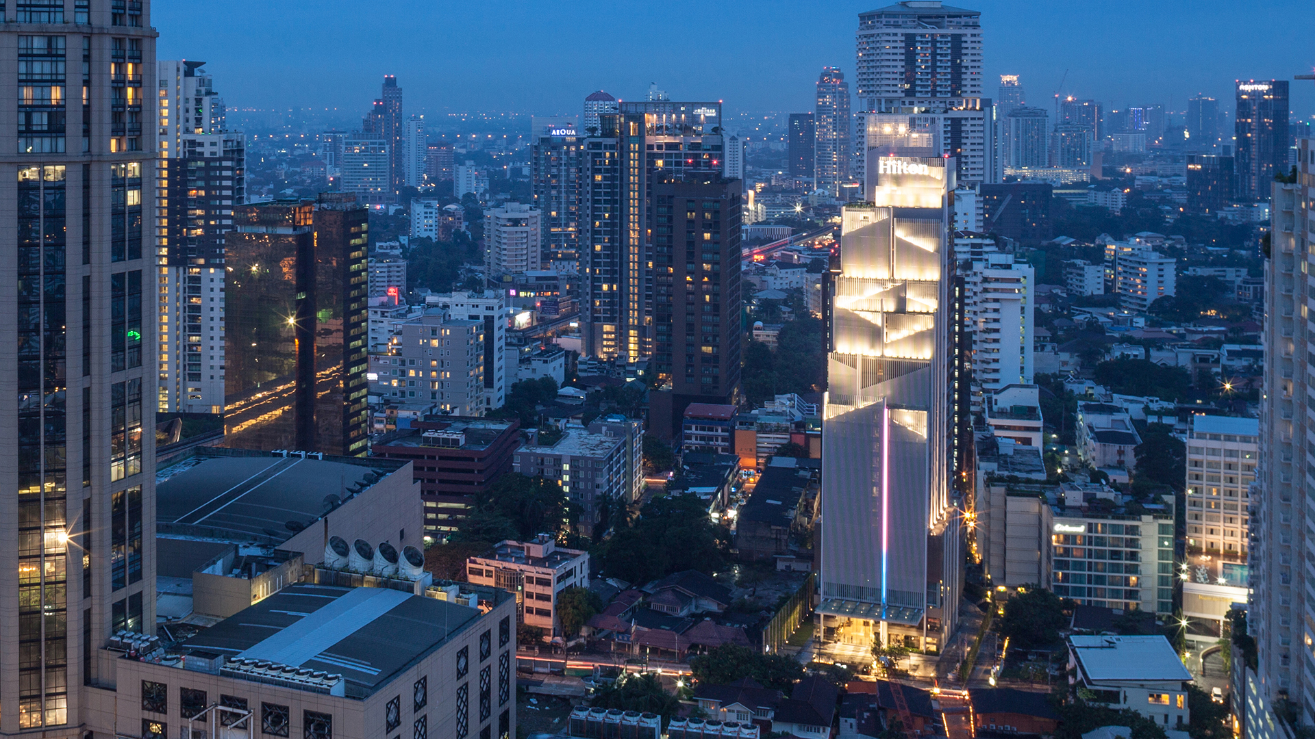
The façade design of this new 5-star Hilton Sukhumvit portrays
a modern, clean look that stands out from the surrounding buildings whilst complementing
its sister property, the Double Tree by Hilton on Sukhumvit 26. Vertical fins
on western facade draws inspiration from Japanese origami, reflecting the
populous Japanese community in the area.
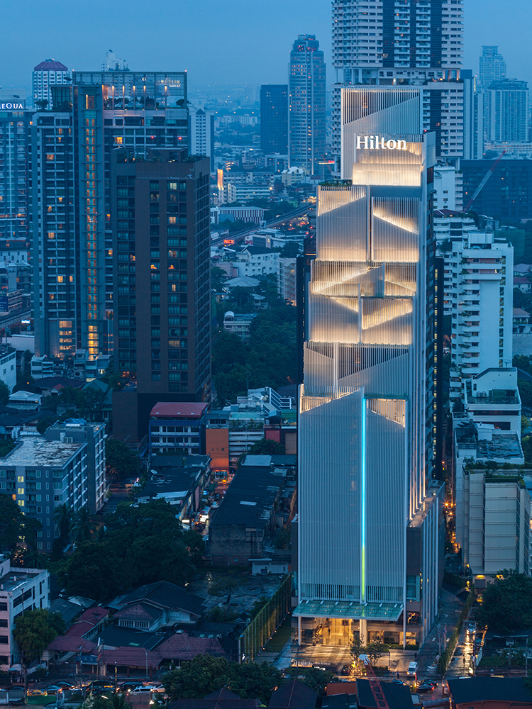
Height restrictions were overcome by designing a stepped
tower, creating a strong, artistic, aesthetic element at the façade. Multiple
vertical lines connect the top of the tower to the ground resulting in slender
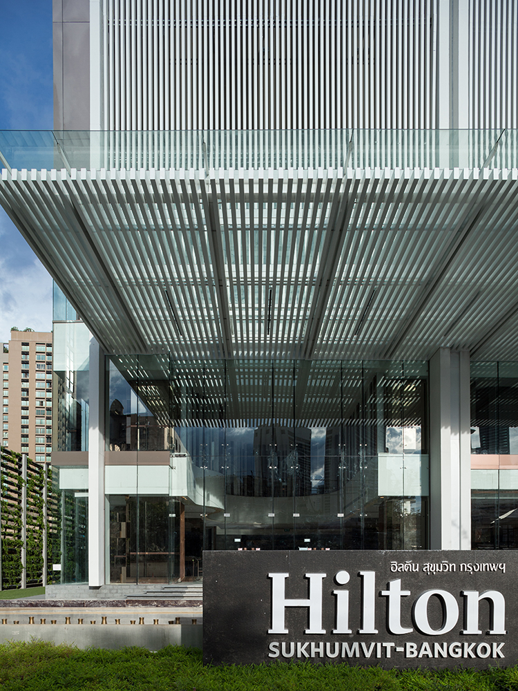
proportions, rendering an elegance in tune with the Hilton brand. The
double-height lobby space is visible through clear glass walls, enabling
visitors and guests to experience the full volume of the lobby from outdoors.
North and south elevations combine
horizontal glazing lines with aluminium-clad walls that are patterned to match
the distinct interior layout of the guest rooms. The rooftop swimming pool at
the northern façade is a feature that adds colour to the building, and the view
from the pool adds an exciting sense of the drama to the city skyline.
General colour scheme and composition of elements for the
exterior, a mixture of white vertical fins with warm gray cladding and dark
gray painted solid wall base, results in a clean elegant look. The interior
design of the public spaces focuses strongly on creating an exciting and trendy,
yet luxurious feel. A selection of artistically composed mixed & matched
fine materials reflects the sophistication that is expected of the Hilton brand,
resulting in bright, fresh interior spaces that keep its visitors pleasantly
surprised as they move from space to space.
Guestrooms design emphasizes comfort, with a more
understated elegance expressed through the use of warm colours and fine
materials, as well as a distinctive geometric pattern. Objects of art are
strategically placed inside and outside the building to add an extra dimension
to the spaces.
The landscape architect worked well with the tight spaces
surrounding the building to create a mixture of fun, artistic, green spaces and
high green-screen walls. The hotel’s front entrance area was designed to address
the requirements of the Feng Shui master as well as functionality and aesthetic
design.
L65 & Associate
K.C.S. & Associates
W. AND ASSOCIATES Designs
PIA Interior
P Landscape
With Light
Beourfriend
Curtain Well Design Consulting
TRI Construction Management
C.E.S.


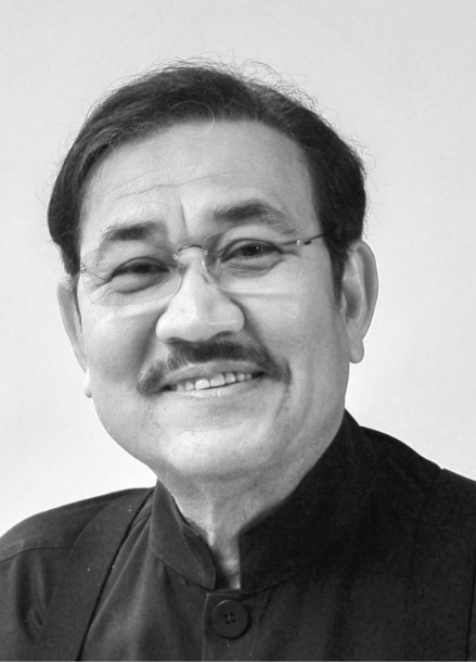
In 1980, Prabhakorn received his Bachelor of Architecture degree from Chulalongkorn University. He continued his education at the Catholic University of America in Washington DC, where he graduated with a Master of Architecture degree in 1984. Whilst in Washington DC, Prabhakorn worked at Robert Schwinn & Associates in Maryland before returning to Thailand and joining A49 in 1985. At A49, he has been responsible for a wide range of projects ranging from mega complexes and high-rise buildings to houses. Most of these are located in Thailand, whilst others are located in other countries in the region, including: China, Malaysia, Singapore and Vietnam. His work has also extended outside that region, for example, to the United Arab Emirates and India. All add breadth to the A49 portfolio of work. His main role has been to establish major policies, design concepts and strategic planning initiatives. He was appointed as President of Architects49 Phuket in 2005 and President of Architects49 International in 2006.
Prabhakorn actively served the Association of Siamese Architects (ASA) as its Head of Public Relations from 1992 to 1994, as its Vice President of Foreign Affairs from 1995 to 1997, and as the President of ASA during 2002-2004. He has also participated in many subcommittees for both the ASA and the Architect Council of Thailand (ACT). He is an active Council Member of the ACT, with his present duties for them extending into 2018. He has been an Honorary member of the Japan Institute of Architects (JIA) since 2003.
Prabhakorn has been a key member of A49 since its foundation, and has the honour of being trusted by Nithi Sthapitanonda (the Founder of A49) to be President and Managing Director of 49Group.

In collaboration with Landscape Architects 49, we have extensive experience in master planning and urban design. We have worked for both government and private sectors from large urban development to planning of new university campus.
